Legend
The Legend component lets you add and configure a legend for component by using the same data source.
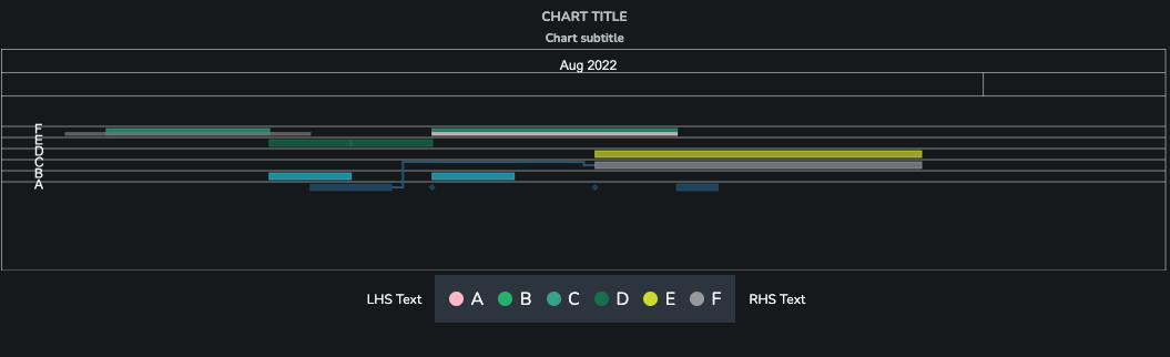
In the above screenshot you can see a Legend component placed below a Gantt Chart.
Displaying Data
Data
The user can use any SDD and specify the series key to display the legend for any data.
Placement
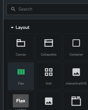
The Legend component can be placed in any type of container, but generally it would be placed in a Flex component (found under the Layout group):
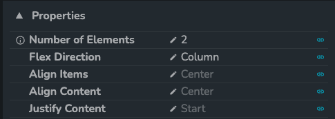
To show the Legend under the component as in the example above you need to set the number of elements to 2 and set the Flex Direction property to Column.
One important thing to note is that when placing the Legend in a Flex container the Legend's own Horizontal Alignment won't work.
Properties
Font sizes
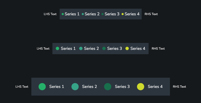
You can choose between 3 different font size options.
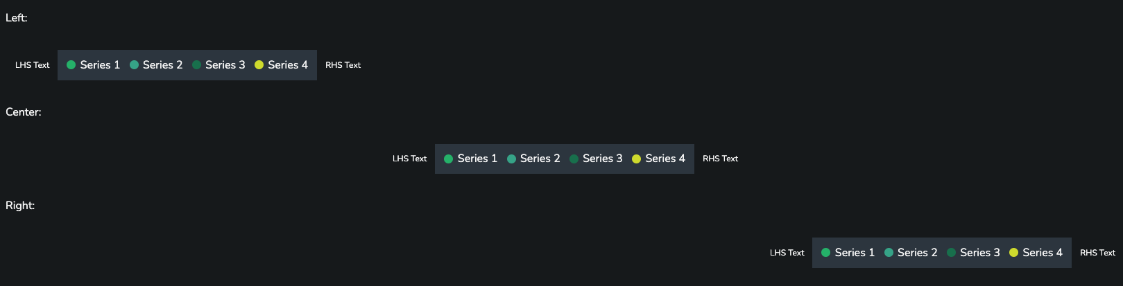
Horizontal Alignment
The user can specify how the Legend should be aligned horizontally. However, as noted above this property has no effect when using Flex container.
Item Alignment
The items are aligned automatically to take as much space as they need to fit in the container.

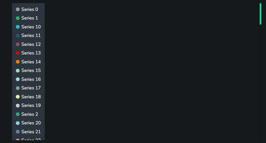
However, it is possible to specify as fixed amount of columns or rows to display.
An example with 1 column:
An example with 3 rows:

Colors
The color overrides data also needs to be an SDD. You need to specify which key in the data specifies the series and which the color. When overriding the colors there is no need to override all series, only the ones specified ones. If there is no color specified for a series then a color from the theme will be applied instead.
Markers
By default, a circle is used as the symbol for each series. You can use the Marker Symbol Key to change this behaviour.
Marker Symbol Key: Use this to set the marker symbol used for each series. If set, this should point to a column in Series Colors that contains one of the following strings: circle/diamond/square/triangle.